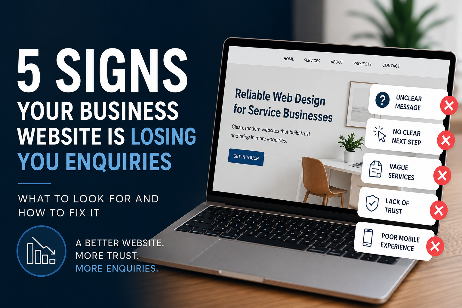
5 Signs Your Business Website Is Losing You Enquiries

5 Signs Your Business Website Is Losing You Enquiries
A website does not need to look terrible to underperform.
In fact, a lot of business websites look “fine” at first glance. They have the basics in place, some service information, a few images, and a contact form somewhere on the page. But despite that, they still do not generate the level of enquiries the business was hoping for.
That is usually because the issue is not whether the website exists.
The issue is whether the website is helping people take the next step.
If your website is not clearly guiding visitors, building trust, and making it easy to get in touch, there is a good chance it is losing you enquiries without you even realising it.
Here are five of the most common signs.
1. It is not clear what you do straight away
When someone lands on your website, they should be able to understand within a few seconds:
- what your business does
- who you help
- what type of work you take on
- what they should do next
If a visitor has to scroll too far, read too much, or guess what your services actually are, there is a good chance they will leave and look elsewhere.
This is especially common with small business websites that use vague headlines like:
- “Welcome to our website”
- “Professional solutions for all your needs”
- “Quality services you can trust”
These phrases may sound fine, but they do not actually tell the visitor much.
A stronger website is much more direct. It makes the offer clear and reduces friction immediately.
What to fix
Review your homepage hero section first. Make sure it clearly explains:
- what you do
- who you do it for
- what action someone should take next
2. There is no obvious next step
One of the biggest reasons websites lose enquiries is simple:
The visitor is interested, but there is no clear next step.
That might mean:
- no visible call to action
- too many different buttons
- contact details hidden too far down the page
- service pages with no enquiry route
- forms that feel like an afterthought
If someone has to work to figure out how to contact you, book a call, request a quote, or send an enquiry, you will lose people.
A good website should make the next step feel obvious and easy.
What to fix
Make sure every important page includes a clear action, such as:
- request a quote
- book a call
- send an enquiry
- contact us
Keep it consistent across the site so people always know where to go next.
3. Your services are too vague or too broad
A lot of businesses know what they do, but their website does not explain it clearly enough for someone new.
This often happens when service pages are:
- too short
- too generic
- trying to cover too much at once
- written from the business owner’s point of view rather than the customer’s
For example, a visitor might be asking:
- Do they offer what I need?
- Do they work with businesses like mine?
- Are they local?
- Can they handle a job of this size?
- What makes them different?
If the website does not answer those questions, people hesitate.
What to fix
Make your service pages more specific.
Each one should clearly explain:
- what the service is
- who it is for
- the kind of problems it solves
- why someone should choose you
- how they can get in touch
The clearer your service pages are, the easier it is for the right people to enquire.
4. The website does not build enough trust
People rarely enquire based on design alone.
They enquire when the website makes them feel confident.
That confidence usually comes from a combination of things:
- clear messaging
- professional layout
- strong testimonials
- examples of previous work
- recognisable clients
- a modern mobile-friendly experience
- visible contact details
- a site that feels maintained and current
If a website feels dated, thin, or slightly neglected, that trust drops very quickly.
It does not matter how good your business actually is if the website creates uncertainty.
What to fix
Add more trust signals throughout the site, such as:
- testimonials
- project examples
- client logos
- case studies
- clear contact details
- better imagery
- local credibility where relevant
Sometimes small trust improvements make more difference than a full redesign.
5. It works on desktop, but not properly on mobile
A huge amount of website traffic now comes from mobile devices, especially for local services and small businesses.
If your website is hard to use on mobile, you will lose enquiries.
Common mobile issues include:
- text too small
- sections too cramped
- buttons hard to tap
- poor spacing
- forms that are awkward to complete
- navigation that feels clumsy
A website might look perfectly acceptable on a laptop but still create a poor experience on a phone.
That can be enough to stop someone enquiring.
What to fix
Check your website properly on a phone and ask:
- Is it easy to read?
- Is it easy to navigate?
- Are the calls to action clear?
- Can someone contact us quickly?
- Does the page still feel polished?
A mobile-friendly website is not just a nice extra anymore. It is essential.
Final thought
A website does not need to be dramatic or flashy to work well.
But it does need to make things easy.
If your website is unclear, hard to navigate, low on trust, or weak on mobile, it may be losing you enquiries even if the business itself is doing great work.
In many cases, the answer is not a complete rebuild.
Sometimes a few well-judged changes to structure, messaging and user journey can have a noticeable impact.
At Dove Design Ltd, we help businesses improve website clarity, trust and enquiry flow through clean, professional websites that are built to support real business growth.
If your website feels like it is underperforming, it may be worth reviewing what is getting in the way.
www.dovedesign.io/contact
Web Design Experts
Empower Your Online Identity with Tailored Design Magic

FAQs
Got questions? We’ve got answers! Explore our FAQs to learn more about our web design process, services, and how we can help bring your digital vision to life.
A professionally designed website helps build trust with customers, improve search engine visibility and convert visitors into enquiries.
Webflow offers several advantages over WordPress including better performance, built-in hosting, improved security and easier visual editing.
Our agency is distinguished by a combination of creativity, technical expertise, and a client-centric approach. We prioritise understanding your business goals, delivering high-quality solutions, and providing excellent customer service throughout the entire process.Dove Design Ltd is a Webflow-specialist web design agency based in County Durham. We focus on building fast, SEO-ready websites for local businesses and public sector organisations.
At Dove Design we specialise in building websites using Webflow, a modern website platform known for fast performance, strong SEO capabilities and easy content management.
Every project is scoped carefully based on your business goals, required functionality and long-term growth plans.
Most of our projects fall within the following ranges:
- Landing Page Websites – From £1,200
- Foundation Websites (5 pages) – From £2,500
- Growth Websites (8–10 pages + CMS) – From £3,750
- Enterprise Website (larger / multi-structure builds) – From £5,500+
Rather than charging “per page”, we design structured platforms that are built to generate enquiries, support SEO and grow with your business.
For example, a CMS template (which may power hundreds of blog or service pages) is designed as part of the overall system — not priced as individual pages.
Each project includes essential pages such as legal documents, thank you pages and 404 pages where required.
A small business website in the UK typically costs between £1,500 and £10,000, depending on the number of pages, design complexity, and features such as CMS, booking systems, or e-commerce.
At Dove Design Ltd, most business websites fall between £2,500 and £5,500, depending on the scope of the project.
Please see our Pricing page for more information
Most small business websites take between 3 and 6 weeks to design and build depending on the number of pages and content required.
Yes. All websites we build are designed with SEO best practices including fast loading speeds, mobile responsiveness and structured content.
Yes. Dove Design works with startups, small businesses and organisations across the UK looking for professional, high-performance websites.
Although Dove Design is based in County Durham, we work with clients across the UK.
Extremely secure. Webflow has some of the highest international standards for security which is also constantly being upgraded and monitored. You can read more about Webflow's security here.
To begin a website project we typically need your business goals, brand assets, content and examples of websites you like.
The timeline varies depending on the complexity of the project. Simple websites may take a few weeks, while more complex projects, such as e-commerce platforms, can take several months. We provide detailed project timelines during the consultation phase.
Happy Clients
Hear what our clients have to say about our Webflow services
"I cannot praise Dove Design enough. From the very start of this project they were very professional, providing great support, advice and guidance at all times. The process was quick and completed before the deadline and the final product was brilliant. Thank you so much for everything."
Dave set out a clear plan to bring my vision to life, and with his knowledge and idea’s, it’s turned out way better than I had anticipated. I couldn’t be happier with the design. He has been helpful and communicative throughout. Very much looking forward to continuing to work together on this project and quite possibly future projects!
How can we help?
We're here to answer any questions you may have. Contact us today!