UX Case Study: How Small Tweaks Increased Conversions

Introduction
User experience (UX) is often misunderstood as something that requires a complete website redesign. While redesigns have their place, they are not always necessary to achieve meaningful results. In many cases, small, strategic UX improvements can deliver the biggest gains.
This UX case study explores how a series of targeted tweaks helped turn a high-traffic website with disappointing conversion rates into a more effective, user-friendly experience that encouraged visitors to take action.
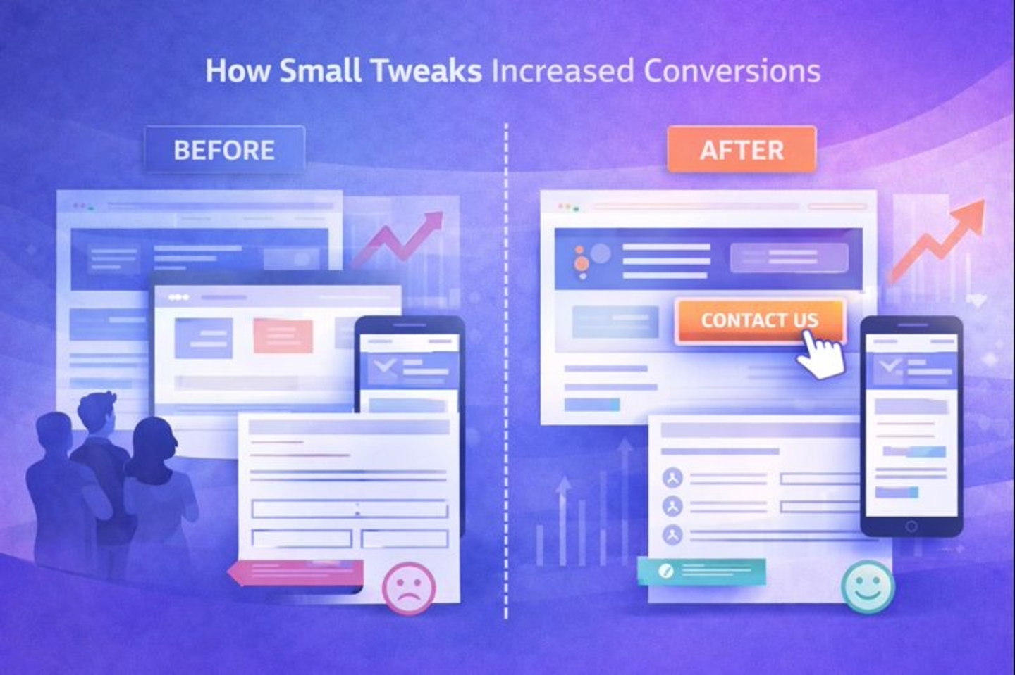
Identifying the Problem
On the surface, the website appeared to be performing well. It was attracting a consistent stream of visitors through organic search and referrals, and key landing pages were receiving healthy traffic.
However, deeper analysis told a different story. Using analytics and user behaviour data, we identified several issues:
- Users were dropping off before completing enquiry forms
- Bounce rates were high on important service pages
- Mobile users were leaving the site more quickly than desktop users
The conclusion was clear: interest wasn’t the issue — friction was. Visitors wanted the service, but obstacles in the user journey were preventing them from converting.
UX Improvements Made
Rather than starting from scratch, we focused on refining the existing experience. Each improvement was designed to make the site easier to use, clearer to navigate, and faster to act upon.
Simplified Navigation
The original navigation included too many options, which created decision fatigue and distracted users from key actions. We streamlined the menu to prioritise high-value pages and removed unnecessary items.
Result:
Users could find what they needed more quickly, reducing confusion and drop-offs.
Clearer Calls to Action (CTAs)
Calls to action were inconsistent in style, wording, and placement. We introduced clearer, more prominent CTAs with consistent language such as “Contact Us” and “Get a Quote,” placed strategically after key content sections.
Result:
Users were guided more naturally through the site and toward enquiry points.
Reduced Form Friction
The enquiry form was longer than necessary and requested information that wasn’t essential at the initial stage. We reduced the number of required fields, improved spacing, and made error messages clearer.
Result:
Form completion rates increased as users felt the process was quicker and less intrusive.
Improved Mobile Spacing and Layout
On mobile devices, buttons and form fields were too close together, making interaction difficult. We improved spacing, increased tap target sizes, and simplified layouts for smaller screens.
Result:
Mobile usability improved significantly, leading to better engagement and fewer abandoned sessions.
Results
After implementing these UX improvements, the impact was measurable and immediate:
- Increased enquiries without increasing traffic
- Reduced bounce rate, especially on service and landing pages
- Longer session durations, indicating improved engagement
These results demonstrated that UX optimisation can unlock existing potential rather than relying solely on attracting more visitors.
Lesson Learned
This project reinforced a key UX principle:
UX is about removing friction, not adding features.
By focusing on clarity, simplicity, and ease of use, small UX tweaks can deliver substantial improvements in performance. Before committing to a full redesign, it’s often worth reviewing how users interact with your current website — the biggest opportunities are usually already there.
Web Design Experts
Empower Your Online Identity with Tailored Design Magic

FAQs
Got questions? We’ve got answers! Explore our FAQs to learn more about our web design process, services, and how we can help bring your digital vision to life.
Every project is scoped carefully based on your business goals, required functionality and long-term growth plans.
Most of our projects fall within the following ranges:
- Landing Page Websites – From £1,200
- Foundation Websites (5 pages) – From £2,500
- Growth Websites (8–10 pages + CMS) – From £3,750
- Enterprise Website (larger / multi-structure builds) – From £5,500+
Rather than charging “per page”, we design structured platforms that are built to generate enquiries, support SEO and grow with your business.
For example, a CMS template (which may power hundreds of blog or service pages) is designed as part of the overall system — not priced as individual pages.
Each project includes essential pages such as legal documents, thank you pages and 404 pages where required.
A small business website in the UK typically costs between £1,500 and £10,000, depending on the number of pages, design complexity, and features such as CMS, booking systems, or e-commerce.
At Dove Design Ltd, most business websites fall between £2,500 and £5,500, depending on the scope of the project.
Please see our Pricing page for more information
Webflow offers several advantages over WordPress including better performance, built-in hosting, improved security and easier visual editing.
Yes. All Webflow sites have SSL included in their hosting plans.
To begin a website project we typically need your business goals, brand assets, content and examples of websites you like.
We believe in collaborative design. Our process includes client consultations, feedback sessions, and regular updates. We ensure your vision aligns with the design, and your input is valued throughout the development process.
Although Dove Design is based in County Durham, we work with clients across the UK.
Yes, we follow best practices in web development to ensure your site is search engine optimised (SEO). This includes using clean code, optimising images, and implementing SEO-friendly URLs to enhance visibility on search engines.
We offer a comprehensive range of services, including custom web design, web development, responsive design, e-commerce solutions, and content management system (CMS) development.
Yes. Webflow allows clients to easily edit text, images and blog posts without needing technical knowledge.
Yes! We handle everything from when the design is handed over. We either gain access to the clients DNS and launch the site ourselves or we work directly with their IT team to have a successful launch together. Webflow us usually live within a few seconds.
Most small business websites take between 3 and 6 weeks to design and build depending on the number of pages and content required.
We prioritise mobile responsiveness in all our designs. Our websites undergo thorough testing across various devices and browsers to ensure a seamless user experience on smartphones, tablets, and desktops.
Happy Clients
Hear what our clients have to say about our Webflow services
Dave set out a clear plan to bring my vision to life, and with his knowledge and idea’s, it’s turned out way better than I had anticipated. I couldn’t be happier with the design. He has been helpful and communicative throughout. Very much looking forward to continuing to work together on this project and quite possibly future projects!
“We are delighted with the new Safety Dogs website. The design is clean, accessible, and easy to navigate, making it a valuable tool for our community outreach. The site’s performance and security features have given us peace of mind, and the ability to easily update it ourselves has been a game changer. We’re extremely happy with the results.”

How can we help?
We're here to answer any questions you may have. Contact us today!